Wall Art Tips — Mindful Interiors
How to Choose Wall Art That Works With Your Furniture and Color Palette
September 28, 2026
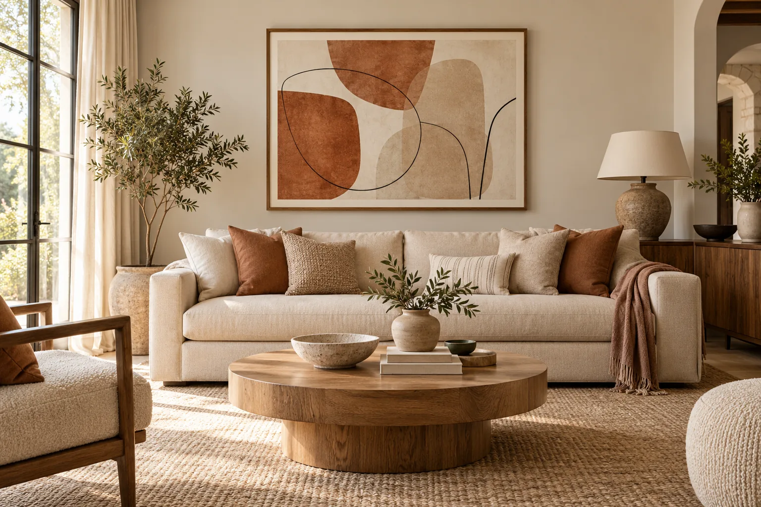
Choosing wall art becomes much easier when you stop asking whether a print simply “matches” your furniture.
A room does not need every color, material and artwork to repeat one another perfectly. In fact, interiors often feel more natural when different elements are connected without looking overly coordinated.
The better question is: “What does this room already have, and what does it need from the artwork?”
That might be calm, contrast, warmth, depth or simply one strong focal point.
At Stillume, we like to think about this through a simple sequence: Room → Need → Artwork. Start with the room you already have. Decide what is missing. Then choose art that helps create the atmosphere you want.
Start With the Room You Already Have
Before choosing artwork, look at the elements that already carry the most visual weight. In a living room, that might be the sofa, rug or dining table. In a bedroom, it could be the bed, headboard or wall color.
Pay attention to the room’s dominant colors, but also look beyond color. Wood tones, fabrics, metal finishes, shapes and natural light all contribute to how the space feels.
This is why choosing art based only on whether it contains the same beige as your sofa can be unnecessarily limiting.
Interior designers often approach artwork in relation to the room’s overall atmosphere, scale and existing furnishings rather than treating exact color matching as a requirement — this guide on How to choose art for your home by Homes & Gardens follows the same philosophy.
Start by asking: “What is already visually dominant in this room?”
Once you know that, it becomes easier to decide whether the artwork should quietly support the space or deliberately stand apart from it.
Decide What the Room Needs
Two rooms with the same neutral sofa may need completely different artwork. One might already feel busy and benefit from something quiet and spacious. Another might feel flat and need a stronger focal point.
Think about the atmosphere you want to create before thinking about a particular style.
A restful bedroom may benefit from soft forms, restrained contrast and quieter colors. A neutral living room might handle something stronger. A bright coastal room may benefit from artwork that reinforces openness and light.
That gives us a more useful question than “Does this match?” Ask instead: “What should this artwork add to the room?”
If you like structured approaches, The 3-Step Method for Choosing Wall Art from Better Homes & Gardens looks at room function, personal taste and scale in a similar way.
Blend, Bridge or Contrast
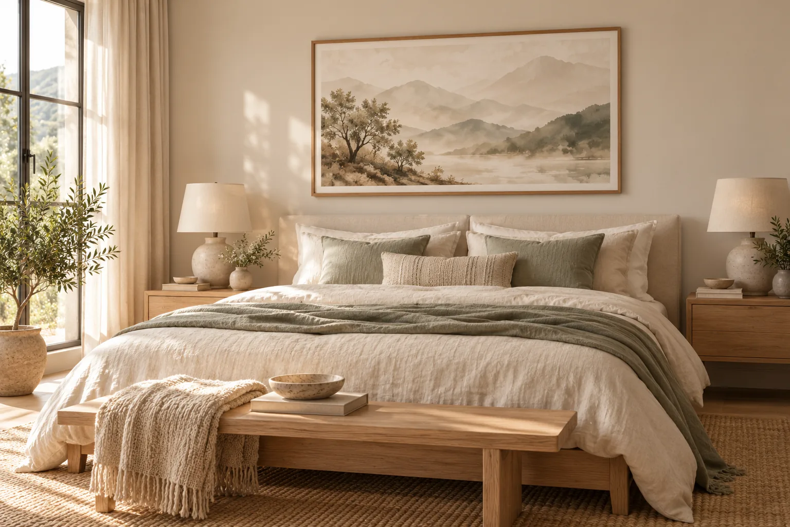
One practical way to choose wall art is to decide what relationship the artwork should have with the room.
Blend
The artwork continues the existing atmosphere. A room built around warm beige, pale wood and soft fabrics might use artwork with similar neutral tones and gentle shapes.
The goal is not invisibility. The artwork still needs presence, but it feels naturally connected to its surroundings.
This approach works particularly well when the room already has enough visual interest and you want the walls to support a calm overall composition — the Zen & Balance collection is built around exactly this kind of quiet connection.
Bridge
Sometimes artwork can connect elements that already exist in different parts of the room.
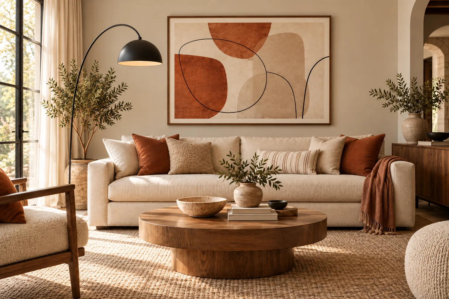
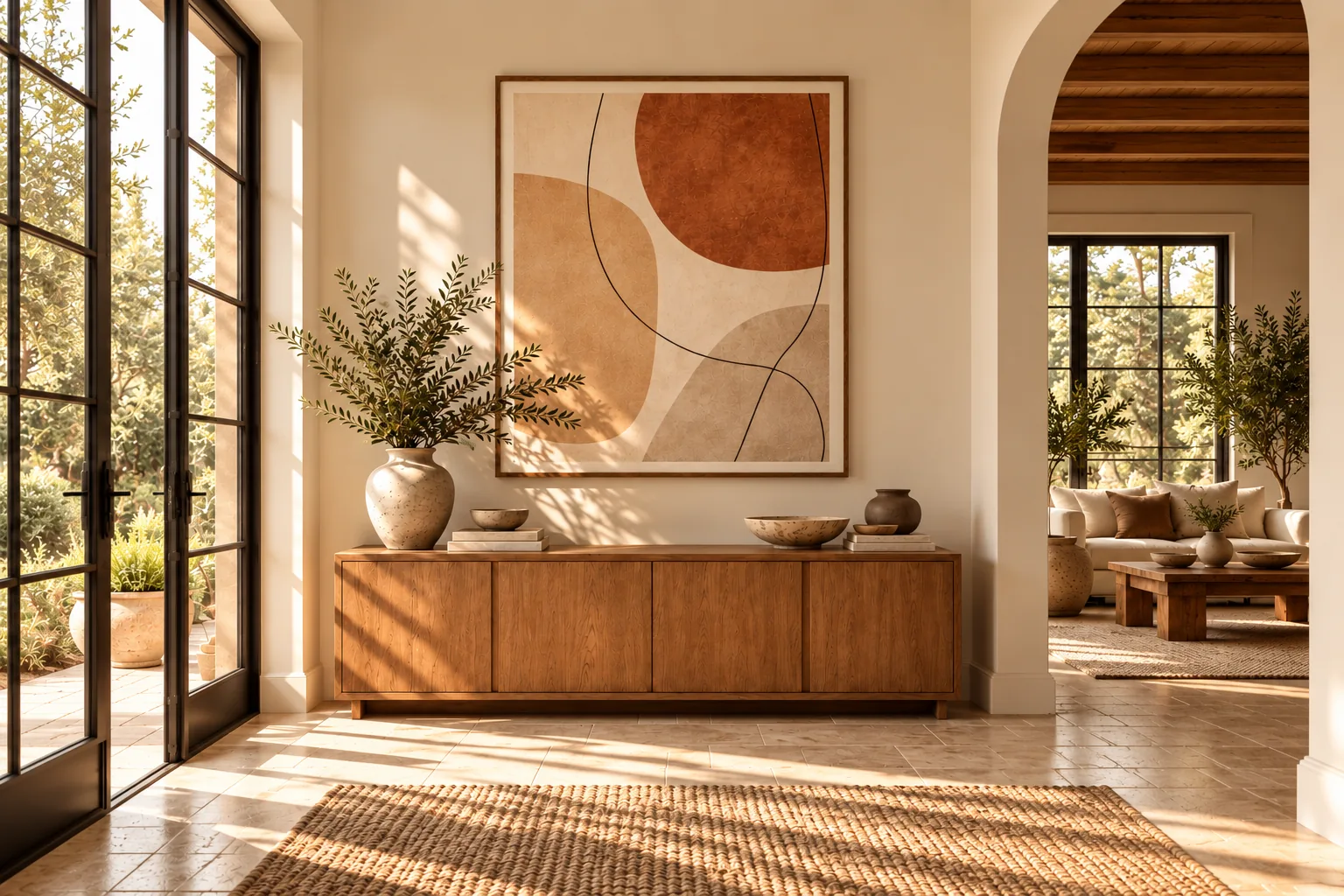
Imagine a space with a terracotta cushion, a black lamp and warm wooden furniture. An artwork does not need to copy the entire palette. It might simply contain terracotta and dark line work, creating a visual connection between objects that were already there.
This is often more sophisticated than trying to match everything — Abstract Woman Prints often work precisely this way, echoing one or two tones while keeping their own character.
Contrast
Sometimes the room does not need more harmony. It needs energy.
A largely neutral interior can become more memorable when artwork introduces a darker silhouette, a stronger form or a deliberate color accent.
Contrast does not mean choosing something that clashes with the room. It means allowing one element to become more visually prominent — a single statement piece from Single Prints can be enough.
Repeat One Connection, Not Every Color
One of the easiest mistakes when choosing wall art is trying to match every color in the print to something in the room. You usually do not need to.
Instead, find one meaningful visual connection. A muted terracotta shape might relate to a cushion. A black line might echo a lamp or window frame. A sandy background might connect naturally with pale timber furniture.
That single relationship can be enough to make the artwork feel intentional. The rest of the piece is then free to introduce its own character.
This principle also prevents a room from becoming overly coordinated. When everything matches perfectly, the space can start to feel less collected and more assembled.
For a deeper look at repeating selected colors, scale and texture across a home, Architectural Digest explains How to Create a Color Palette for Your Whole Home.
Consider Visual Weight, Not Just Size
Dimensions matter, but they are not the entire story. Two artworks of identical size can have completely different visual weight.
A soft landscape with large areas of pale color may feel quiet even at a generous scale. A smaller artwork with heavy contrast, bold typography or a strong figure may command much more attention.
So when choosing artwork near a large piece of furniture, consider both physical dimensions and visual intensity. A substantial sofa does not automatically require the loudest artwork in the room — sometimes a large but visually calm print, like those in Minimal Landscapes, creates better balance.
For physical size and proportions, our Printable Wall Art Size Guide covers measurements and placement in detail.
Decide Whether the Artwork Should Lead or Support
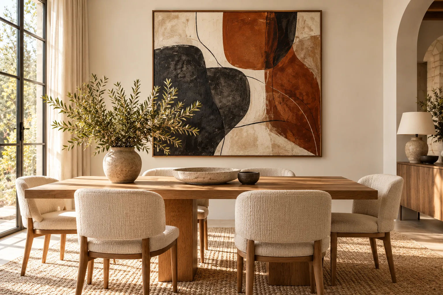
Every room benefits from some kind of visual hierarchy. If the sofa, rug, shelving and accessories are already expressive, the artwork may work best as a quieter supporting element. If the furnishings are restrained, the artwork can take the lead.
This is where choosing by category becomes more useful than choosing simply by color. A room that needs calm may point toward Zen & Balance. A room that needs depth without heaviness may work with Minimal Landscapes.
A bright space that could benefit from a sense of openness might suit Ocean & Coastal. A room that needs personality and stronger visual presence might benefit from Abstract Woman Prints, and a space that needs one distinctive statement piece may suit Single Prints.
And sometimes the most important element is not color or form at all, but an idea. In that case, Motivational Quotes can introduce a short message without requiring the artwork itself to dominate the room.
The category should follow the room’s need, not the other way around.
Think About Mood Before Style Labels
Interior labels can be useful, but they should not become restrictions. A Japandi room does not require every artwork to be labelled “Japandi.” A minimalist room does not need every object to be minimal.
If you are working with that style in particular, we have a dedicated guide on how to choose wall art for a Japandi interior.
It is usually more useful to look at characteristics. Does the artwork feel quiet or energetic? Soft or graphic? Warm or cool? Structured or organic?
Those qualities often matter more than whether the artwork belongs to exactly the same named style as the furniture. This also gives you more freedom to create interiors that feel personal rather than copied from a single design trend.
Let the Artwork Introduce Something New
Artwork does not always need to disappear into the room. One of its most valuable roles is introducing something the furniture cannot.
That might be movement, a view of nature, a human figure, typography or simply a color that appears nowhere else.
So if you genuinely love a piece, do not reject it simply because every color is not already represented in your furniture. Instead, look for a smaller connection and let the artwork bring something new.
Use Nature to Create Space and Depth
Landscape artwork can be particularly useful when a room needs visual breathing room. Horizons, mountains, water and open skies naturally introduce a sense of distance into an otherwise enclosed space.
That does not physically make a room larger. But visually, a landscape can create depth and a calmer focal point.
For that reason, Minimal Landscapes can work well in rooms where you want quiet depth, while Ocean & Coastal can introduce more light, openness and movement. The decision should come from the atmosphere of the individual artwork rather than from the category name alone.
Do a Final Room Check
Before choosing an artwork, step back and look at the entire room rather than the empty section of wall.
Ask yourself three things: “What already dominates the room?” “What does the room still need?” “Will this artwork support that need or compete with it?”
If you can answer those questions, you are already making a more considered choice than simply matching a print to the nearest cushion.
The Goal Is Connection, Not Perfect Matching
Good rooms rarely look as though every object arrived together. They feel connected because certain colors, materials, shapes and proportions quietly relate to one another.
Wall art can become part of that relationship without losing its individuality. You can blend with the room, bridge existing elements or deliberately create contrast. There is no single correct answer.
The goal is to find an artwork you want to live with and give it a role within the space around it.
Because ultimately, the strongest interiors are not built by matching everything. They are built by choosing what deserves to belong together.